Using Italian Regional Marbles in Modern Homes: A Local Stone Guide
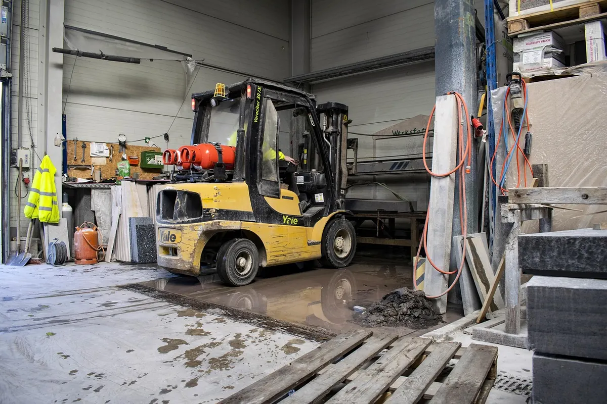
Stand in a stone yard in Carrara, then in one outside Verona, and you come away with two different ideas of what marble is. The Apuan whites are cool, faintly blue in the shade, quiet enough to disappear behind a tap fitting. Veronese stone is warm, often loud, patterned like a contour map. Both are Italian marble. Neither belongs in every room.
That distinction is worth holding on to before you fall for a photograph on a supplier’s website. Italy’s quarry districts each have their own palette and working temperament, and in a contemporary interior those differences matter far more than the finish sample you carry around in your bag. What follows is a working guide to the main regional characters and the places where each one earns its keep.
The Region Is the Real Specification
Italian marble is not one product. It is a set of stones tied to particular valleys, and the trade names say so: Bianco Carrara, Rosso Veronese, Nero Portoro, Verde Alpi. Each name points to a place, a geology and a fairly narrow range of behaviour.
Two habits will save you from an expensive mismatch. First, ask where the block was quarried, not just what the slab is called. Some names are colour descriptions rather than origin labels, and the same name can cover stone from several concessions with visibly different movement. Second, look at the actual bundle or slab you are buying, not a sample board. Marble varies block to block, and a ten-centimetre chip may show none of the veining that will dominate a three-metre island.
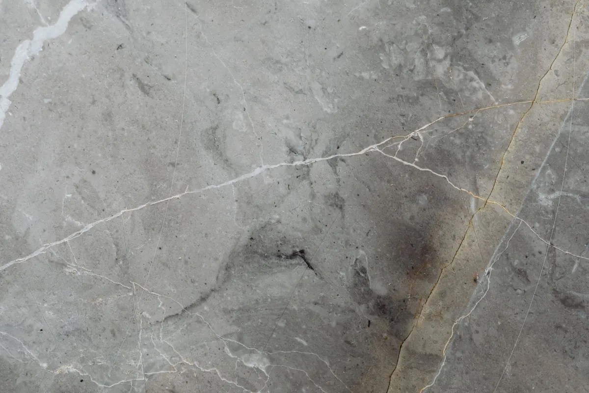
There is a third habit, and it is the one most clients learn too late: look at the slab in raking light, not under a showroom spotlight. Raking light reveals the direction of the vein, the density of the background, and the small clouds or quartz lines that a frontal photograph flattens into nothing. If you are buying remotely, ask for a short video that moves across the slab from one end to the other, with a hand or a measuring tape in frame for scale. A still image can make a restless stone look calm and a calm stone look dull.
The useful question is not “Is this Italian marble?” but “Which Italian marble, quarried where, and asked to do what?”
Carrara and the Apuan Alps: The Whites That Do Everything
The Apuan basin above Carrara has supplied the reference white for centuries, and it remains the safest starting point for a modern interior that wants stone without theatre. The classic Bianco Carrara is a cool white or pale grey field with soft grey veining, sometimes misty, sometimes more linear. It is forgiving in a way that louder stones are not: it can sit behind a brushed-steel tap, under a pale oak cabinet, or against a microcement wall without asking to be the subject of the room.
Within the district, names matter. Bianco Carrara C is often the quieter grade, with less movement and a more even ground. Statuario tends to have a brighter white background and stronger, more sculptural grey veining, so it reads as a feature even when you use it in a plain slab. Calacatta, also from the Apuan area, usually brings a warmer white and veining that can run from grey to gold. None of these names is a guarantee of quality on its own; they describe a look, and the block in front of you is the real evidence.
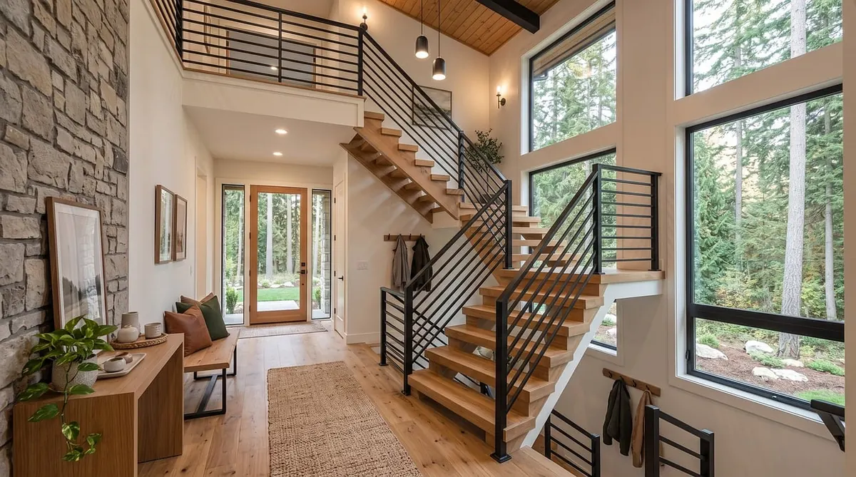
In practice, the Apuan whites are the stones that can do almost every job in a contemporary home. A honed Bianco Carrara island with a waterfall end and a simple 20mm edge looks calm but substantial. A full-height splashback in the same stone, bookmatched behind a hob, gives a kitchen a quiet vertical line without turning it into a showroom. In a bathroom, a Carrara vanity top with an integrated sink and a matching upstand feels clean and architectural. On a fireplace surround, a slab of Statuario can hold a room together with nothing more than a plain plaster wall and a dark firebox.
White marble is not invincible. It is calcium carbonate, so it etches when acid sits on it: lemon juice, wine, vinegar, some bathroom cleaners. In a kitchen, that means using chopping boards, wiping spills promptly, and accepting that a honed finish will develop a patina rather than stay factory-perfect. A penetrating sealer helps with staining but does not make the stone acid-proof. This is not a reason to avoid Carrara. It is a reason to choose it for the right rooms and to brief the fabricator honestly about how the house is used.
Verona and the Warm North: Pattern as Architecture
Veronese stone is a different creature. Where Carrara whispers, Rosso Veronese and its warm relatives tend to announce themselves. The palette runs through brick red, terracotta, ochre, cream and deep brown, often in brecciated patterns that look like a geological map pressed into the surface. Giallo Reale and similar warm stones from the Verona area bring a honeyed, sometimes veined ground that can feel almost luminous in a north-facing room.
In a modern interior, that pattern is best treated as architecture rather than wallpaper. A powder room with a Rosso Veronese vanity top and a matching splashback can carry a whole scheme with one gesture. A fireplace surround in a warm brecciated stone gives a minimal living room a focal point that does not rely on art or colour. A bar front or a dining table in the same family feels generous and tactile, especially when the edges are kept simple and the cabinetry around it is matte and plain.
The mistake is to let a warm, busy stone fight with everything else. If the stone is the event, keep the joinery quiet, the metal finishes restrained, and the lighting soft. Avoid pairing a heavily patterned Veronese marble with a strongly grained timber, a brightly coloured lacquer and a patterned floor in the same sightline. The stone will not lose the argument, but the room will.
Nero Portoro and Verde Alpi: The Specialist Stones
Nero Portoro, from the Ligurian coast, is the black marble with gold or white veining that behaves like built-in jewellery. In a small powder room, a Portoro vanity top against warm white plaster and unlacquered brass is almost enough. In a larger kitchen, it is better used as a bar top, a splashback panel or a table rather than a whole run of cabinetry, because the stone’s drama is concentrated and it can make a big room feel heavy if it is overused. It also rewards careful fabrication: the darker the stone, the more visible every edge, seam and fingerprint.
Verde Alpi, from the Aosta Valley, is the deep green stone with white or pale veining that reads as both mineral and botanical. It is a natural for bathroom vanity tops, fireplace surrounds and sculptural table bases, where its colour can be enjoyed at close range. It is not a neutral, and it should not be treated as one. Pair it with pale plaster, warm wood, aged brass or brushed stainless steel, and let it be the one saturated element in the room. As with Portoro, a little goes a long way.
Both of these specialist stones ask for samples at full scale. A small tile of Nero Portoro can look like a black square with a gold scratch; a whole slab can look like a night sky. A chip of Verde Alpi can look grey-green; a bookmatched pair can look like a landscape. Ask your fabricator about sealing, brittleness and the direction of the vein before you commit to a layout.
Matching Stone to Room: A Practical Matrix
The fastest way to choose well is to match the stone’s temperament to the room’s job. A stone that is beautiful in a photograph may be wrong for a family kitchen, and a stone that seems quiet in the yard may be exactly right for a wall.
- Kitchen island and splashback: quiet Apuan whites, especially honed Bianco Carrara or a calm Statuario. Reserve strong veining for a waterfall end or a single full-height panel rather than every surface.
- Bathroom vanity: Carrara or Statuario for a cool, calm wash; Nero Portoro or Verde Alpi for a compact room where drama is contained and easy to enjoy.
- Fireplace surround: Rosso Veronese or Verde Alpi as a focal point in a neutral room. Keep the firebox detailing simple so the stone does the work.
- Bar front or dining table: a bookmatched pair in Portoro or Verde Alpi, with fewer seams and a rounded or mitred edge that feels good to touch.
- Flooring: honed Carrara in low-traffic or well-managed areas. Avoid polished white marble in wet zones unless you have tested slip resistance and accepted the maintenance.
One rule covers most of these choices: use the loud stone where you will see it for a short time or from a seated position, and use the quiet stone where you will live with it all day. A powder room can take a stone that a kitchen cannot. A fireplace can take a pattern that a floor should not.
Finish, Thickness and Sealing: The Decisions That Change the Stone
The same slab can look formal, rustic, soft or severe depending on how it is finished. Polished marble deepens colour and reflects light, which makes it feel luxurious in a bathroom or on a wall, but it also shows etching and water marks more readily. Honed marble has a matte surface that hides scratches and fingerprints and feels more contemporary in kitchens and floors, though it can stain if left unsealed. Brushed or leathered finishes are useful where you want texture and a lower sheen, but they are not a substitute for understanding how the stone will age.
Bookmatching and Layout
Bookmatching opens a slab like a book so the veining mirrors across a seam. It can be spectacular on a fireplace wall, a splashback or a bar front, but it needs a fabricator who will plan the cut before the stone is touched. On an island, a bookmatched pair can become too symmetrical or too busy; sometimes a single slab with the vein running lengthwise is the more sophisticated choice. Ask to see a scaled layout drawing with the seams, sink cutouts and edge profiles marked.
Sealing and Maintenance
Most marble in a modern home benefits from a penetrating sealer, applied after fabrication and renewed according to the stone’s absorption and the room’s use. Sealing is not a permanent shield. It buys you time to wipe up oil, wine and coffee, and it makes routine cleaning easier. Use pH-neutral cleaners, avoid acidic bathroom and kitchen products, and keep a simple maintenance kit rather than a cupboard of hopeful remedies. If a stain does occur, call the fabricator before you start experimenting.
Buy the slab, not the sample. Buy the fabrication, not just the stone.
That is the practical heart of using Italian regional marble in a modern home. The region tells you what the stone wants to be. The slab tells you what it actually is. The fabrication tells you whether it will sit calmly in your kitchen for the next twenty years or become the detail you wish you had questioned. Choose the district for its character, choose the block for its movement, and choose the room for its tolerance. Do that, and the stone will feel local to the house rather than imported from a brochure.